 2023 – The Year in Review
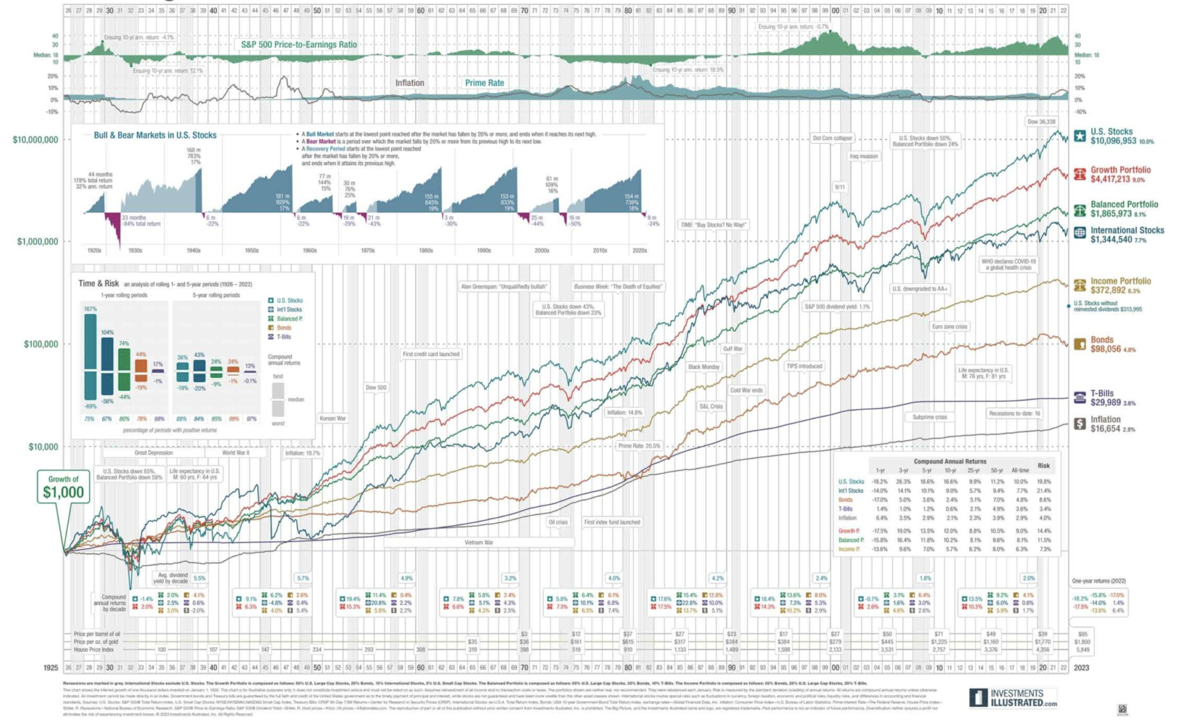
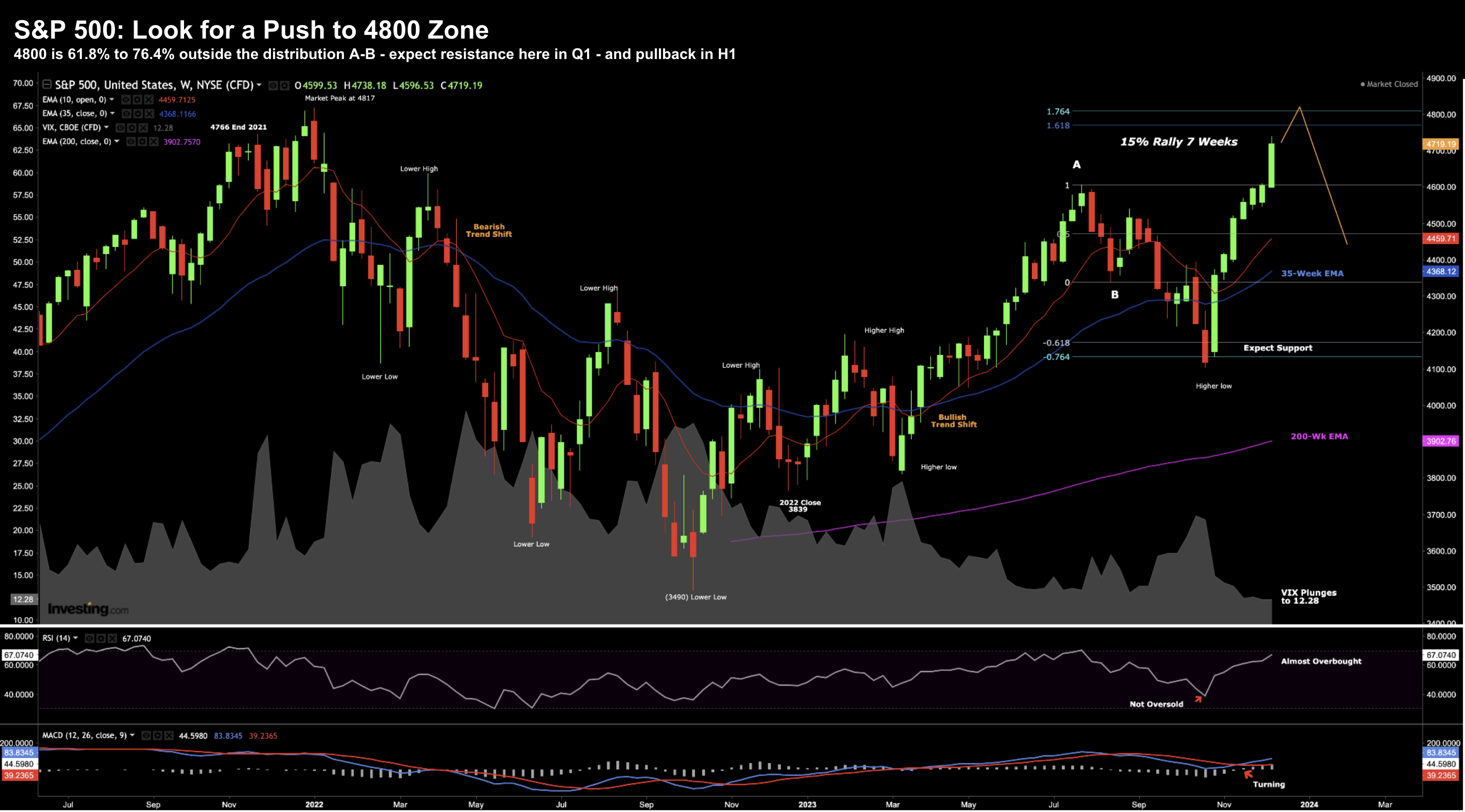
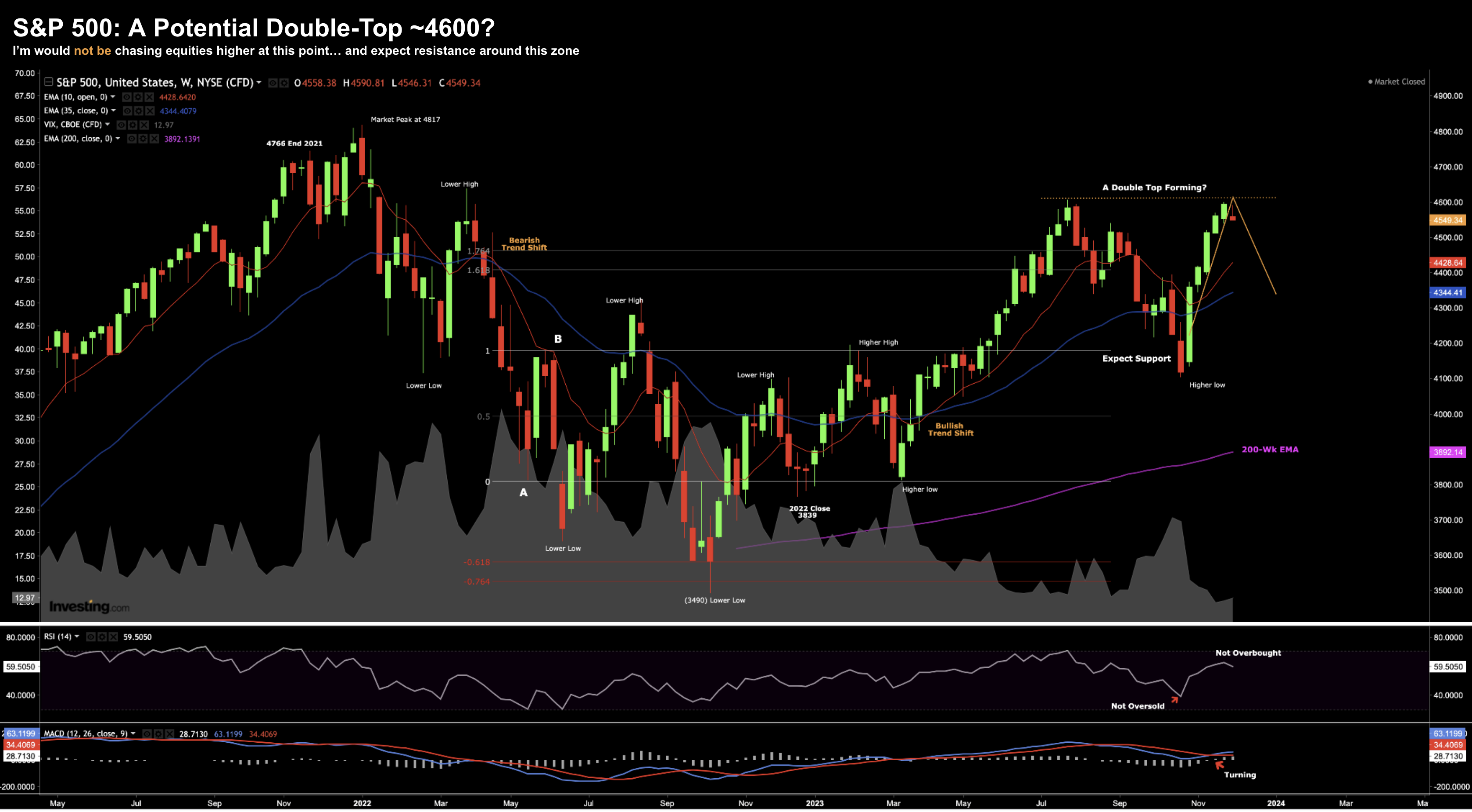
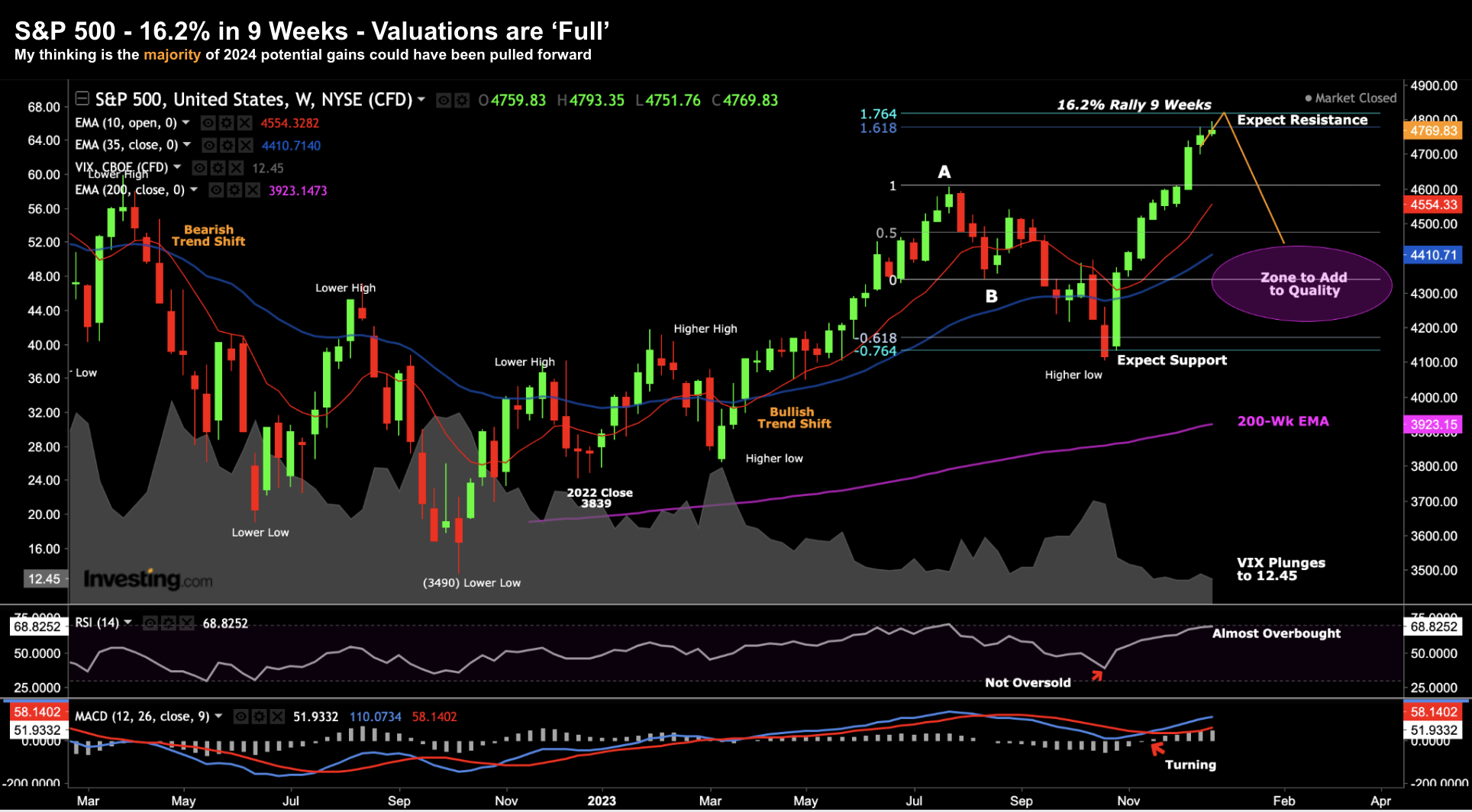
2023 has come to a close... and what a year it was. For many, it will go down as one of the more challenging. For others, they will have banked some very attractive gains. In short, the S&P 500 recovered from its worst year in over a decade - finishing the year 24.2% higher. As for myself, my portfolio returned 19.63%. I made some errors this year (which I will discuss) but also had a couple of wins. Net-net - it was a solid year given the unchartered waters we were navigating.