Words: 2,096 Time: 9 Minutes
- Fed adds more fuel to the stock market
- Three valuation charts which give me pause
- Patience required for a meaningful correction
This week the Fed gave the market its Christmas present.
Powell & Co were clearly in a festive mood – delivering a dovish cut and some stocking stuffers.
Clearly the market was on Santa’s “nice” list this year.
Not only did the Fed cut the federal funds rate from 4.0% to 3.75% – its lowest since October 2022 – they also announced new plans to expand their balance sheet (which I will talk to below)
Ho ho ho!
Despite inflation remaining well above the Fed’s target of 2.0% – we can only assume the Fed are concerned about a weakening labor market.
And on that basis – the Fed has no reservations about the economy “running hot” for a bit longer.
That said, President Trump still wasn’t happy.
He continues to insist that interest rates should be much lower – calling Powell a “stiff” – criticising the Fed’s third consecutive quarter-point cut as “too small.”
What would you expect from a real-estate guy? 1.0% rates would be still too high for Trump!
Irrespective – I have reservations about the Fed dovishness.
For example, I’m still not convinced they have fully tamed inflation – with the impact of tariffs still to come in 2026.
During the first half of next year – we will be 12 months into the tariffs – where companies would have largely reduced their (pre tariffed) inventories.
What then?
But that’s not the view of the Fed – where their statement described inflation as only “somewhat elevated” – where Powell avoided issuing stronger warnings
Let’s take a look…
“Group Think” at the Fed
The outcome of the meeting suggested a surprising degree of consensus – with very little hawkish independence.
Immediately this struck me as “group think”… one of the worst things you can have in any board / decision making committees.
For example – if you have a large blind post – you’re far more likely to miss it if everyone thinks the same way.
Committees (of any kind) always welcome dissent if supported by the data.
But the FOMC’s vote to cut the rate saw only two dissents:
1. Stephen Miran argued for a 50 basis point cut (Miran is a ‘Trump plant’ – no surprise there); and
2. Austan Goolsbee and Jeffrey Schmid dissented in favor of no cut.
There’s no room for hawks with “Trump’s Fed”.
Rumors had anticipated as many as five members dissenting against a December cut – but the final vote failed to reflect that rumored split.
Further signaling a lack of strong, collective hawkish resolve, the anonymous “dot plot” revealed no real shift in long-term rate expectations from their previous Sept meeting.
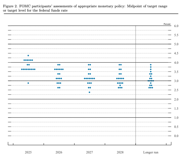
For example, below is the dot plot from September:
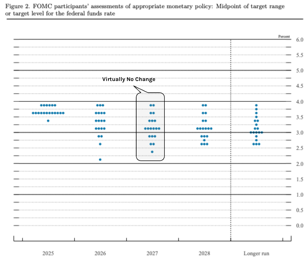
Now compare this to December 10 2025:
Over the past 3 months – the 2027/28 dots showed minimal movement, with clear majorities still expecting the fed funds rate to remain between 3% to 4%
For what it’s worth – my guess is Miran’s dot is below 2.5%.
But again, what strikes me is the clear absence of strong public dissent.
Coming back to my concerns around inflation…
The dot plot showed that the committee’s collective estimate for price rises has declined, with all members loyally agreeing that inflation will be back at the 2% target in 2028.
Blind spot?
Their concerns about rising prices and the impact of tariffs have now all but evaporated.
To that end, the market believes the temporary price effects of tariffs will be over within a year.
We will see how that works out (but please let me know if you see prices falling)
“Baby QE” – Balance Sheet Shift
From mine, Fed group think was not a surprise.
What did get my attention was the further expansion of their balance sheet.
The Fed told us they would resume purchasing bonds next year, starting with $40B next month.
While officially presented as a technical measure to “maintain order” (i.e., liquidity) in money markets, this move has raised concerns about a return to QE and the erosion of central bank independence.
Steven Blitz, chief US economist of TS Lombard, argues that by expanding the balance sheet, the Fed is ensuring Treasury spending is financed without market volatility, thereby making the Fed a “subservient instrument to the administration” and removing the market’s ability to signal caution over government spending.
Hmm mmm.
And whilst the Fed can wordsmith the use of QE with language such as “maintaining order in the markets” – the reality is this is balance sheet expansion.
That’s very accommodative for markets (it’s not restrictive) – regardless of whether they are buying short-term bills or longer-term bonds (which I expect will come further down the track as the 10-year continues to rise).
Why does the market need additional liquidity of up to $40B per month? What do the Fed see that we don’t?
Is it trouble in the labor market? Or something else?
Powell also took time to say official jobs data could be overestimating how many people are employed (a point that Mike Shedlock has been making for years).
Powell mentioned the 3-month rolling average is about 20,000 jobs below what is reported. From Yahoo Finance:
Speaking at his post-meeting news conference, Powell said Fed staff believe the government may be overstating monthly job creation by as much as 60,000 jobs.
Given that published data show the economy adding roughly 40,000 jobs a month since spring, Powell’s statement means the real number could plausibly be negative — to the tune of a 20,000-job decline per month.
Yes, I’m the first to point out there is a lot of noise with the monthly data of any kind (hence the 3-month rolling average is a better data point).
And this week we will get a double payrolls number (given the recent government shutdown) – which is highly unusual.
If this is worse than expected – it may help explain why the vast majority of Fed members are less keen to tighten policy.
However, how will the market take that?
Bad news is more good news?
Market Reaction
Markets were very happy to hear of fresh “Baby QE” and rate cuts.
The Santa Rally is back on (for now at least)
Traders bought both stocks and bonds, interpreting the rate cut and the balance sheet plans as a green light for growth.
The S&P 500 made a new record high…. however the Dow and Small Caps surged.
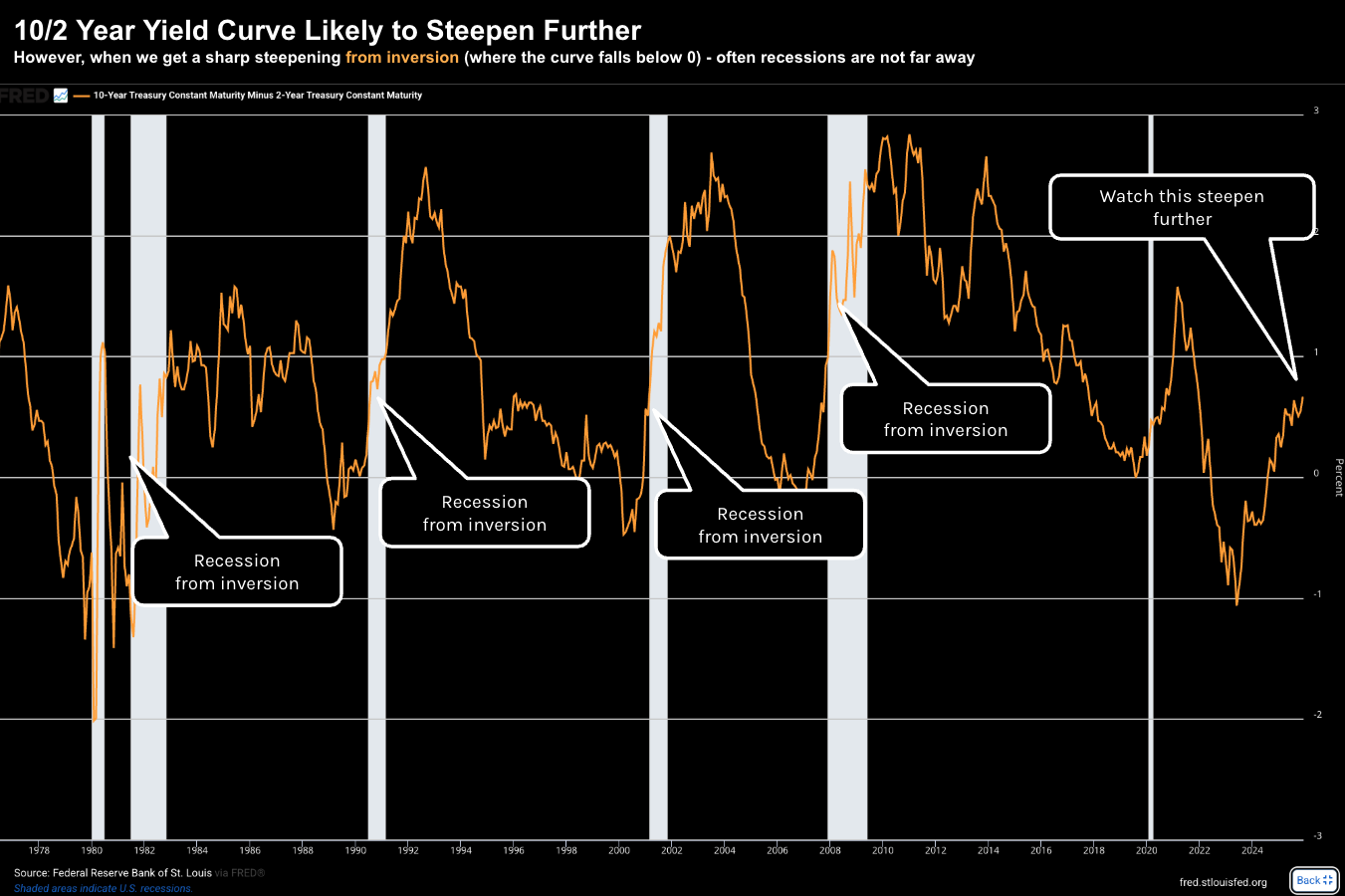
This bullish expectation was reflected in the yield curve, where the spread between the 10-year and 2-year Treasury yields ticked back above 60 basis points.
In other words, the yield curve is steepening.
And if you ask me – it’s about to get a lot steeper.
A steeper yield curve, with higher yields on long-term bonds, generally implies market confidence in future economic expansion that will eventually necessitate higher interest rates.
However, when you have a steepening yield curve from a point of inversion – that also tends to signal trouble ahead (i.e., as the long end continues to rise)
Take a look at what we have seen with the past 6 recessions.
Each recession saw the yield curve steepen sharply from the inversion (i.e., below zero).
Will 2025/26 be an exception?
But with stocks set to continue their rally into year’s end (pending what we see next week with the labor report) – should we be concerned?
My answer is yes… especially with respect to valuations.
The Fed doesn’t appear too concerned about juicing the the market – but I think there are many reasons investors should exercise caution.
Here are three charts which give me pause…
Chart 1: Fwd PE’s & Subsequent 10-Yr Returns
Not long ago I shared this missive – referencing the great work of Deutsche Bank’s Jim Reid.
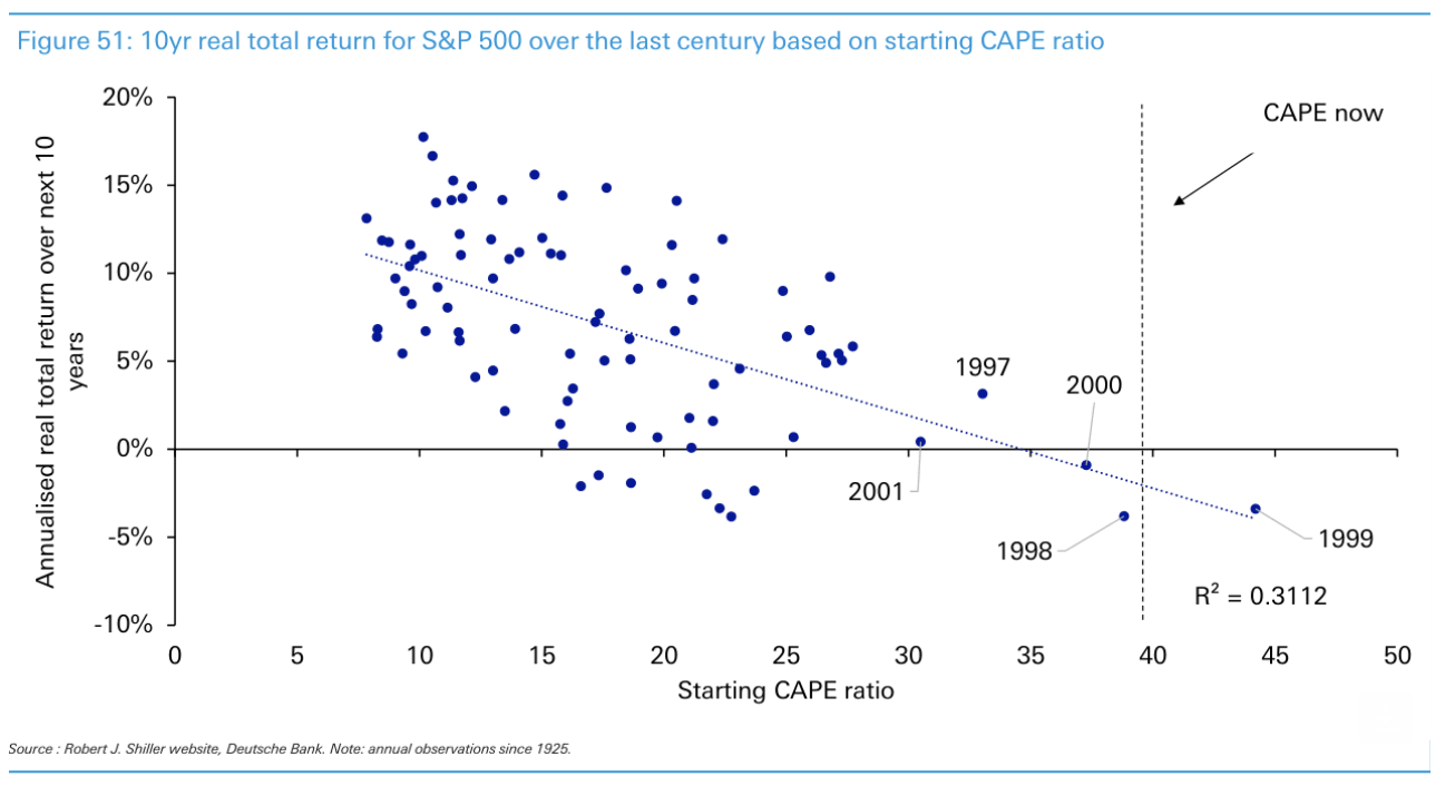
Reid cited Robert Shiller’s CAPE Ratio (cyclically adjusted price/earnings ratio, based on average real earnings over a decade) – producing this chart.
In short, from a cyclically adjusted price/earnings ratio perspective – we are about as high as we’ve been at any time since the dot.com bubble:
John Authers – who writes for Bloomberg – echoed the findings of the above chart with this:
From mine, this chart tells you everything you need to know.
As I mentioned earlier – the market currently trades at almost 23x its expected forward earnings.
It might be higher by the time you read this…
History tells us that the subsequent 10-year returns are likely to be near zero when forward multiples are this high.
The higher the valuation now – the lower the return over the next decade.
But let me be clear…
As I’ve been saying all year – this does not mean you should abandon stocks and simply wait for the market to “correct 20%”
That would be the wrong move.
For example, Warren Buffett’s portfolio remains about 65% long the market (despite the high valuations).
I have a very similar capital allocation… which has seen my returns exceed 15% year to date.
Now if I decided to hide in a bunker due to stretched valuations (e.g., sitting in say more than 50% cash or higher) — I would have missed out on the gains.
However, it’s very prudent to keep a reasonable amount of gun powder ready.
Stocks will correct… and you want to be able to take advantage.
Chart 2: Hints of The Dot.Com Bubble
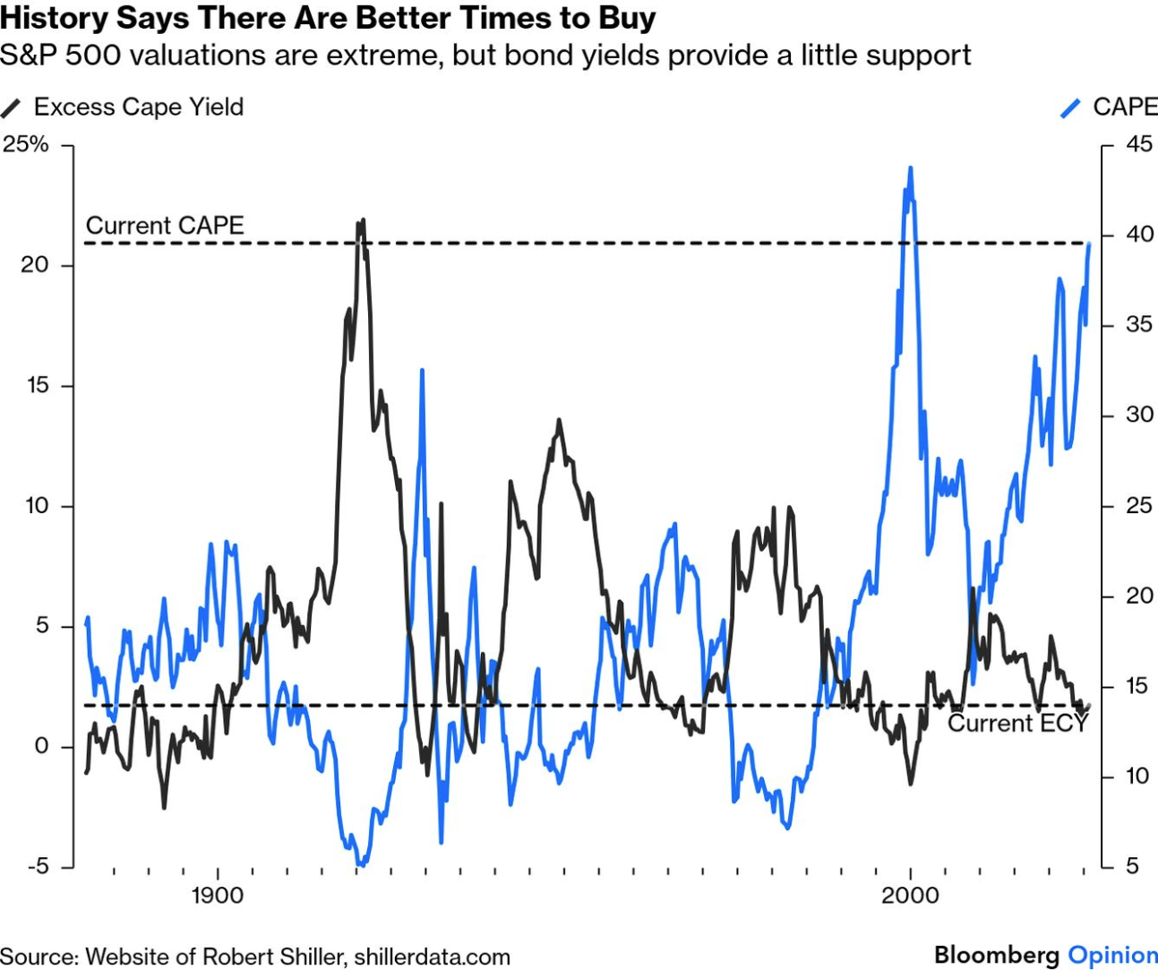
Our second chart comes from Robert Shiller, the “dean of long-term valuations”.
He plots the CAPE ratio vs Excess CAPE Yield (the excess of the CAPE over the 10-year Treasury yield) for the S&P 500, going back to 1881.
The last time we saw a divergence this wide was the dot.com bubble.
Ahhh but hang on… things are different today!
Some readers will be quick to point out the incredible cash flows and balance sheets of the Mag 7; their earnings potential; the strong competitive moats and so on.
Sure, I see that.
I don’t doubt their quality. Most are strong cash producing machines… operating at incredible margins.
But I question their valuations.
You can still lose a lot of money if paying too much for a great asset.
Here’s my bet:
The divergence we find above will close. Stocks will not remain this expensive in perpetuity.
That does not mean they cannot rise further… they can.
But you should understand the risk to the downside is now that much greater.
Chart #3: Stocks vs Bonds
When I’m asked the question of what something is worth – generally I will say “it’s worth what someone will pay”
And that’s very much the case for non-productive assets like precious metals, crypto, art and other assets.
It’s very hard to value an asset which doesn’t produce cash.
However, with respect to assets which are productive and produce cash (which I tend to prefer) — it’s often a good idea to always compare it to something else.
As part of this post – I talked about how Buffett thinks about choosing between asset classes and the risks. In short, Buffett will:
- Estimate the company’s total per share earnings for the next 10 years
- Calculate what you would earn if you invested in bonds instead (typically a much safer bet).
If the bond investment would produce more money over those ten years, the stock is overpriced and selling makes sense.
With that, let’s compare stocks with bonds.
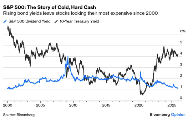
At the time of writing, we are seeing some divergence – however it’s not as extreme as what we find with Shiller’s CAPE vs Excess CAPE Yield.
What’s most important here is investors are receiving a nominal 4.0% to 4.5% risk free.
However, the 10-year yields are as high as they have been in almost 20 years.
And if I am to bet – they are likely to trade higher in subsequent years (mostly opposite the fiscal recklessness from both sides of government)
This ties directly back to my comment earlier about the yield curve continuing to steepen.
Now if I am right that the long-end will rise (whilst the short-end comes down) – you need to ask what will that do to current stock valuations?
Today the market is tolerating a 10-year between 4.0% and 4.5%.
However, I would be interested to see if that would be the case if the 10-year was to challenge 5.0% (or higher)?
Do you think the market will trade at 23x forward earnings?
I doubt it.
But what I can say with some confidence – the days of artificially low long-term bond yields (1% to 2%) are done.
Putting It All Together
There’s no room for hawks at the Fed.
My concern is we are seeing more ‘group think’… increasing the risks of a potential blind spot.
My assumption (which could be wrong) is they’re concerned about a deteriorating jobs front.
Powell’s comments regarding the BLS over-estimating employment is consistent with Mike Shedlock’s thesis.
However, Shedlock would suggest the number is far worse. From Mish Talk:
Powell really misses the mark here:
“If there were big layoffs, you would expect continuing claims to go up. So, it’s a little bit curious.”
Well it’s, not a bit curious.
Continuing claims are not rising steeply because people have exhausted all of their unemployment insurance benefits.
Mish adds that unless jobs collapse, and they easily can, the Fed is going to struggle to justify rate cuts.
And if they do cut again, the most likely reason will be jobs.
It’s not a good place for the Fed.
But what bothers me the most is if the Fed makes money artificially cheap (e.g., via QE and rate cuts) – it induces riskier behaviour.
How?
Lower rates will force people into taking more risk.
That’s not a good thing. This is how bubbles are created – where capital becomes misallocated.
But for now – with the S&P trading near a record highs – equity investors see very little (if any) risks.
Things which make you go hmmm.

