The FOMO Trap: Why a 40x CAPE Ratio Guarantees a Decade of Lost Returns
Words: 1,181 Time: 6 Minutes
- Boo! The FAANGs are out
- A historically expensive market by any measure
- Lessons from Robert Shiller"s CAPE Ratio
A good friend of mine asked for my thoughts this week on increasing their exposure to fast growing (AI) names.
It"s a fair question….
Many AI-related companies are having a terrific year given the strength of their earnings and revenue growth (more on this shortly)
For example, below I"ve charted the relative outperformance of the Magnificent 7 (pink line) vs S&P 500 (white) over the past three years:
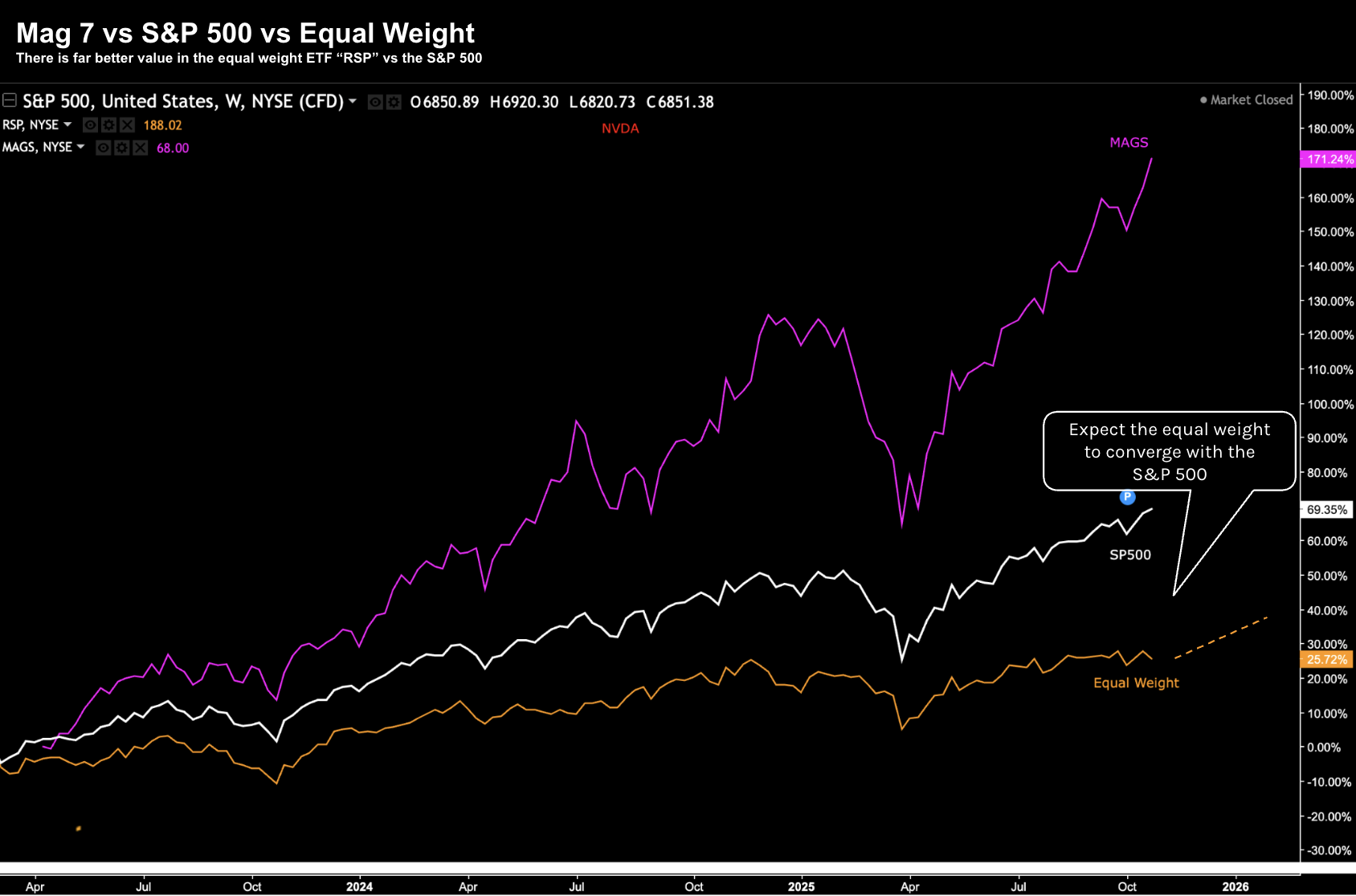
Oct 31 2025
The Mag 7 – Apple, Amazon, Alphabet, Microsoft, Nvidia, Meta and Tesla – have left the other 493 stocks in their wake.
As an aside, the orange line is the equal weighted ETF RSP (where all 500 S&P stocks are given a weight of 0.2% vs the highly concentrated 35% weighting across just 7 names).
My expectation is the delta between the equal weight index and S&P 500 will converge over the next 2-3 years (i.e., the other 493 names on the S&P 500 ar play catch up and/or Mag 7 names cool down).
My friend"s (valid) concern is that she is missing out on a lot of the tech gains.
However, she also is very mindful of the excessive valuations and risk she is potentially paying too much.
And I"m sure she"s not alone…
I reminded her that what you pay for an asset (e.g., stocks, property, gold, bonds) is the primary determinant of your long-term returns.
That is, if you pay too much, the probability of acceptable returns is lower. And as I will demonstrate below – it"s not difficult to determine what is considered too much.
Today investors are being asked to pay an exceptionally high price to own growth (as our earlier Mag 7 chart highlights).
By way of example, I talked more about this here – demonstrating the extreme price to free cash flow (P/FCF) multiples (one of many valuation measures).
This has resulted in the S&P 500 trading at ~25x its forward earnings (which assumes $280 EPS for next year – YoY growth of ~12%); i.e., 6,872 / $280 = 24.5x
Worth the risk? Let"s explore…
It"s Halloween and the FAANGs Are Out
Before we explore the valuation of the broader S&P 500 – a quick word on the Mag 7.
Our earlier 3-year chart highlights their relative outperformance. Hopefully you have maintained some exposure to these names.
From mine, their success is due to the strength of their ecosystem flywheels.
They are all doing exceptionally well – and are likely to continue to do well in the near future.
Let"s consider one of the more important tech metrics – daily active users (DAU"s):
- Google (GOOG) processes about 9.1 billion searches per day. This estimate is based on an average of 3-4 searches per person each day. Google also reported that its new AI-powered tools, such as AI Mode, have reached over 75 million daily active users.
- Meta (META) has over 3.5 billion daily active users across all its platforms, which include Facebook, Instagram, WhatsApp, Messenger, and Threads (ps: I am not one!) This figure represents a significant portion of the global social media population, with a 6% year-over-year increase as of the second quarter of 2025.
- Apple (AAPL) has over one billion people within their highly lucrative (and sticky) ecosystem, with more than 1.6 billion devices in use. The ecosystem includes a vast network of products like iPhones, iPads, and Macs, as well as services like Apple Music and the App Store
- Amazon (AMZN) does not publicly report daily user numbers, but as of 2024, it has over 315M active customers globally. Millions of people visit the site daily to shop, with the United States having the highest number of monthly visits and users
I personally use two of these four services daily (i.e., Google and Apple). I have no Meta or Microsoft products and perhaps use Amazon once per month.
This is the reason you own these names – incredibly powerful moats and flywheels which continue to scale.
This week Amazon"s stock surged 13% after the company reported revenue growth of 20% in its cloud business – whilst raising capex guidance.
Apple"s shares hit new record highs as CEO Tim Cook said demand for the new iPhone 17 demand is "off the chart."
Alphabet (i.e. Google) stock ripped more than 7% after they beat the Street"s forecasts for revenue tied to its Cloud and YouTube businesses.
Similar to Meta and Amazon – Google also plans to significantly ramp up spending next year to build infrastructure that can meet demand around AI.
That said, Microsoft and Meta were lower after they missed (lofty) expectations.
But from mine, the concern is the enormous (unprecedented) capex risks these companies are taking on the expectation that high profitability (and free cash flow) will return in years to come:
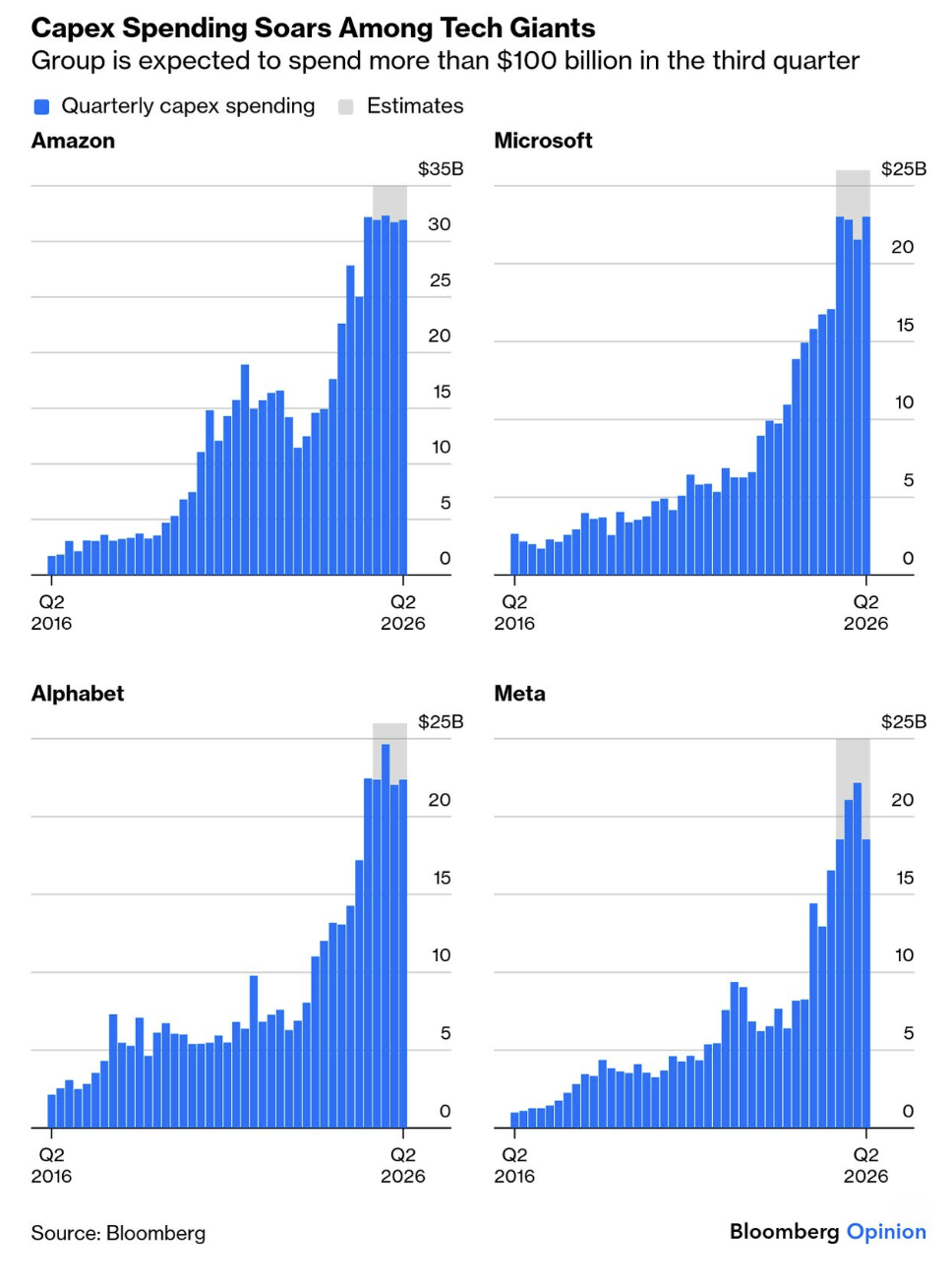
It"s a massive bet… and non are willing to concede ground (Apple perhaps the only exclusion)
As I like to say – I have little doubt that AI will meaningfully accelerate human ingenuity. It"s already re-wiring many of the things we do daily. Very few would argue that point.
However, the question I have it"s monetization and business models.
For example, right now I see AI more akin to electricity.
In other words, it"s a service that we cannot do without. It will be ambient technology – highly integrated into everything we do.
However, providing electricity is a heavily commoditised business.
To that end, my question is whether (eventual) AI oversupply will result in commoditisation for these services?
History tells me that"s a risk.
Time will tell… but today investors who are paying 40x plus free cash flow multiples are betting that will not be the case.
Choose Your Poison…
As I mentioned, there are many ways you can measure the fundamental value for an asset.
One of the more popular measures is a forward price-to-earnings (PE) ratio.
This is not a metric I pay too much attention too when evaluating if I"m getting good value.
I consider PE a lazy calculation (that anyone can do very quickly) – subject to heavily manipulated numbers.
For example, valuations metrics that I prefer include:
- Enterprise Value (EV) / Earnings Before Interest and Tax (EBIT)
- Price to Free-Cash-Flow (P/FCF); and
- Buffett"s "Owner Earnings" (OE) Growth over 10 Years.
The first metric brings the health of the balance sheet into the equation (vs PE which does not).
P/FCF shows me the true financial health of the business (one of Buffett"s most preferred metrics – along with ROIC and ROE)
However with respect to Buffett"s Owner Earnings – it shifts the focus from the misleading reported earnings to the actual cash generated by the business that is available to the owners (shareholders).
Buffett defines OE as:
OE = Net Income + Depreciation & Amortization − Maintenance CapEx
Here I estimate maintenance capex as 80% of all net purchases of property, plant and equipment (i.e., 20% of capex for growth).
As an aside, coming back to our capex charts for large cap tech – both P/FCF and Owner Earnings have been obliterated in the hope future returns will be there.
For now, investors don"t seem to mind at all (which I find very curious).
But I"m getting off track – the point is we can choose to evaluate value by any number of metrics.
You should choose what you think is the most faithful or accurate representation.
In terms of the more popular metrics – widely cited measures include price to earnings (P/E), price to sales (P/S), price to book (P/B) and dividend yields.
Here"s what we find for the S&P 500 ( heavily influenced by the ~35% weighting on just seven stocks)
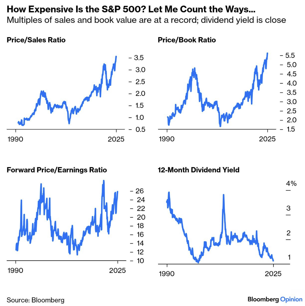
By any measure – the market feels like its approaching nose-bleed territory.
For example, by some measures valuations exceed the ratios we saw during the dot.com bubble of 2000.
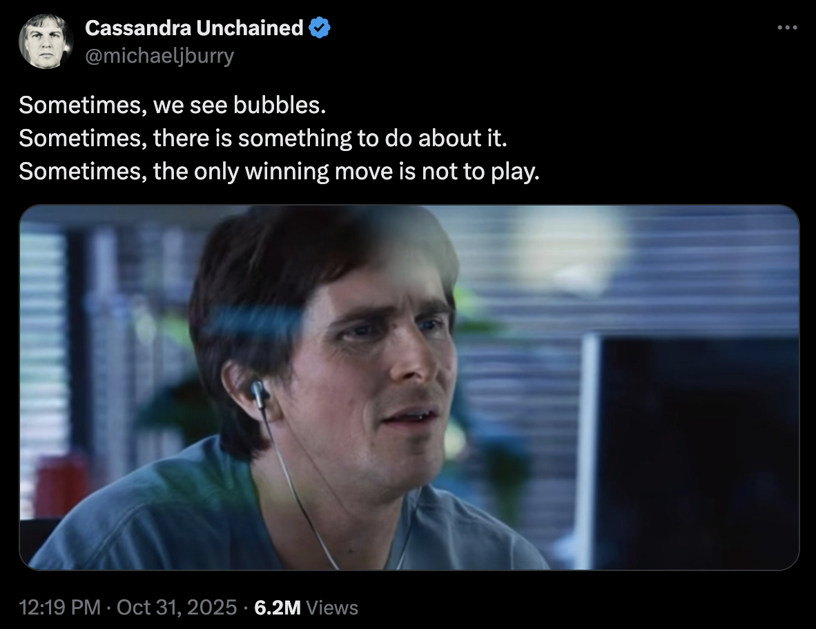
As an aside here Michael Burry"s (from "The Big Short" fame) first tweet in some time.. "sometimes we see bubbles"
Perhaps the best-known long-term measure of stock market value is the cyclically adjusted price-earnings multiple (CAPE), popularized by Yale University"s Robert Shiller.
Leveraging the work of Benjamin Graham – Shiller"s CAPE Ratio measures the Real Stock Price Index / 10-Year Moving Average of Real Earnings
He does this to (a) adjust for inflation; and (b) smooth highly anomalous data (e.g. extreme rations we find during recessions)
Shiller"s spreadsheet (download it here) delivers a CAPE above 40 for the first time since the dot-com bubble burst in 2000. Again, from Bloomberg:
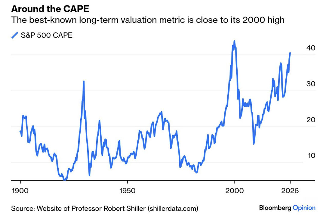
The caveat with Shiller"s model is it can be a poor timing tool.
In other words, whilst the Index is near all-time high valuations — it doesn"t mean that valuations cannot go further for another year or two.
In fact, that"s very likely for the reasons I outlined earlier.
However, we know it"s psychology which drives stock prices in the short-term.
It"s fundamentals over the long-run.
And my bet is Shiller"s charts will revert to the mean… it"s just when.
That"s simply a function of your patience.
What"s History Tell Us?
Let"s come back to my friend and whether it"s a good bet to put cash to work now?
And can we glean anything from Burry"s cryptic tweet yesterday?
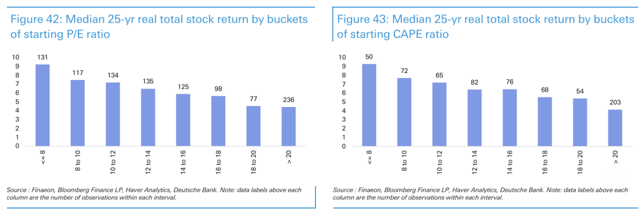
When answering this question – Deutsche Bank"s Jim Reid did some great work.
Reid examined 56 economies with data extending back as far as 300 years, grouping returns by starting valuation levels.
The most powerful predictors of long-term equity performance were the P/E and CAPE ratios measured at the start of the investment period.
For example, over 25-year horizons, there was a clear correlation.
In short, markets purchased at low valuations consistently delivered strong returns, while markets bought at high valuations produced weak returns:
Source: Deutsche Bank – Jim Reid
This echoes my earlier point that your returns are primarily determined by the price you pay (regardless of the asset"s quality).
In other words, whilst you could buy an "Apple" or "Google" today – you could still lose a lot of money despite these being world class operations.
Reid"s analysis proves the cheapest markets by CAPE (below 8x) delivered ~10% annual returns over the subsequent 25 years.
However, the most expensive markets (above 20x CAPE) generated barely 4% annually (return differential of 6% per year).
Again, today we sit at a 40x CAPE ratio.
This overlaps with some analysis I shared a few weeks ago from J.P. Morgan – stating that buying a market with a forward PE above 23x has traditionally seen average returns of ~2% the subsequent 10 years.
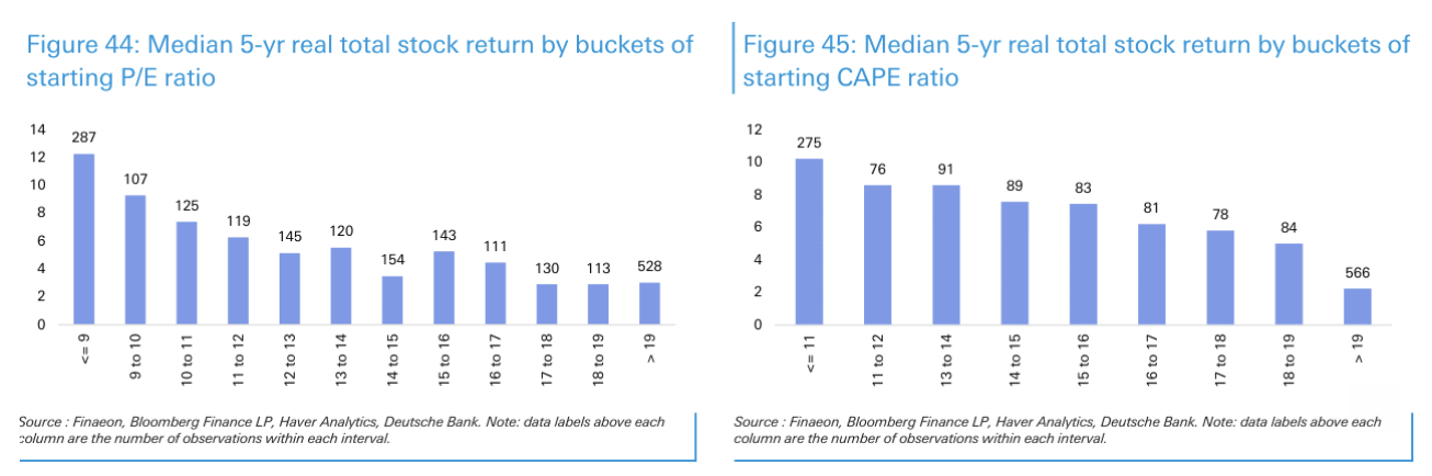
As an aside, if we shorten the duration to 5-year returns – we find similar results:
Source: Deutsche Bank – Jim Reid
In this case, lower valuation markets delivered ~10-12% annual returns over five years, while those with elevated CAPE ratios produced near-zero or slightly negative returns.
Testing Shiller"s CAPE Ratio
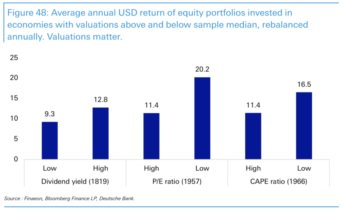
Reid also tested whether starting valuations could identify which markets would outperform by creating portfolios split between economies with high and low valuations, rebalanced annually:
Source: Deutsche Bank – Jim Reid
Again, the same pattern emerges.
Portfolios which are geared towards markets with low starting valuations consistently delivered stronger equity returns than portfolios tilted toward expensive markets.
So Where Are We Today?
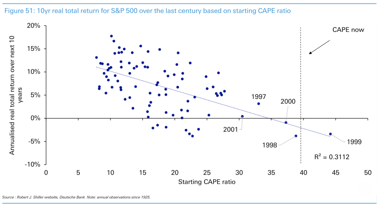
The relationship between starting CAPE levels and subsequent 10-year returns becomes clear when plotted across the past century.
Here we see the (poor) returns when investors purchased stocks between 1997 and 2001.
Source: Deutsche Bank – Jim Reid
Again, as my earlier chart showed, the only time CAPE exceeded current levels was during the buildup to the dot-com bubble in 2000.
Another variation on current market conditions is Schiller"s excess CAPE yield.
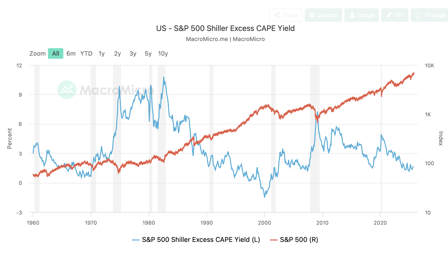
Source: MacroMicro.com
This is defined as: (1 / CAPE Ratio) – Long-Term Interest Rate
In short, this represents the earnings yield premium over bonds:
- High excess yields (1921, 1932, 1949, 1982, 2009) predicted strong subsequent returns
- Low or negative excess yields (1929, 1966, 1999-2000) predicted poor returns
As an aside, read this post where I talked about the lack of risk premium investors are receiving today (and the risks). This is essentially the same premise.
As the 60-year chart shows – the excess CAPE yield stands at just 1.6%, among the lowest readings we have seen outside of the major market peaks that preceded extended periods of weak returns.
Putting It All Together
So what"s my best advice?
Tread carefully.
And whilst Shiller"s CAPE model is not a great timing tool – we are now in the final few innings of this epic bull run from 2009.
I stress that this doesn"t mean that stocks may not drift higher for another year or two yet.
Again, investor psychology (e.g., greed or FOMO in this case) is powerful.
But trying to pick (or time) market highs or lows is not what I do.
I"m a long-term investor who doesn"t suffer the fear of missing out.
I focus more on what I could potentially lose vs what I could gain.
This lens is less common among newer investors. They predominantly focus on the upside and what they"re potentially missing. They fail to look down.
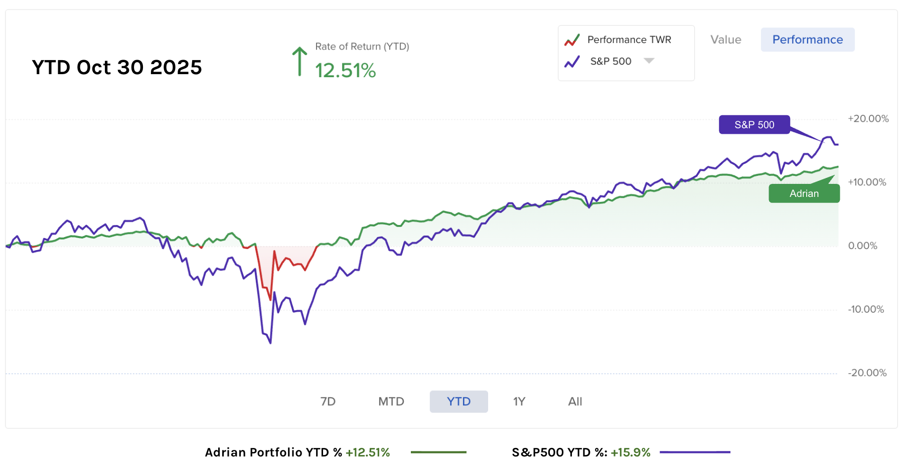
This year (and last) I"ve maintained a modest exposure (~65%) to quality stocks given the high valuations (with Google my largest position) – which sees my portfolio up ~13% YTD.
But I will typically underperform during strong (over-valued) markets.
Why? Because I choose to reduce my exposure.
There will be a time to aggressively add exposure to these (and other) names – but for me – now is not that time.
Stay patient…